Logos and Lockups
The Tufts University logo serves as a clear and recognizable visual for all communications and marketing materials. We have also developed a system that connects the logo with school and department names (referred to as "lockups") to represent how different parts of the university relate to each other.
Consistent and thoughtful usage ensures the integrity of our name and visual identity.
University Logo
University Primary Logo
It is very important that designers do not attempt to construct the logo themselves, as the lettering in the logo has been sculpted especially for Tufts. In addition, do not reproduce the logo by scanning a previously printed version. Such “second-generation” art will degrade the quality of the image and perhaps alter the scale of the various elements.
Clear Space
A mandatory “clear space” around the logo equal to the height of the capital “T” (cap height) must be incorporated into any design using the logo.
Incorrect Uses of Logo
- Never manipulate or distort the Tufts logo, for example, by stretching or compressing it.
- Never try to redesign one element of the logo, for example, the word “university.”
- Never replace an element of the logo or add any graphic elements such as a symbol or punctuation mark.
- Never add words or images to the logo to create a composite logo treatment, and do not use the seal.
University Seal

History
The Tufts seal has a long tradition as an element in university iconography. For most of Tufts’ history, the book pictured at the bottom of the seal was the Bible, and it sat on a mound of rocks surrounded by ocean. Use of the official Tufts seal is reserved for the Office of the President, diplomas, and legal contracts. The seal may also be used for official ceremonial functions and appear on approved plaques, flags, and furniture.

Don't
No unit of Tufts should develop a logo that incorporates the seal. The seal should never be used in communications in lieu of the Tufts logo. Official art should be obtained from the Office of Communications and Marketing and not scanned from an existing copy of the seal.
Lockups Hierarchy
Tufts uses a “parent brand” strategy so that all sub-brands can be easily recognized as belonging to the same university. No unit of Tufts, whether a school, research center, or auxiliary unit, should develop an individual logo that would compete with the official Tufts logo.
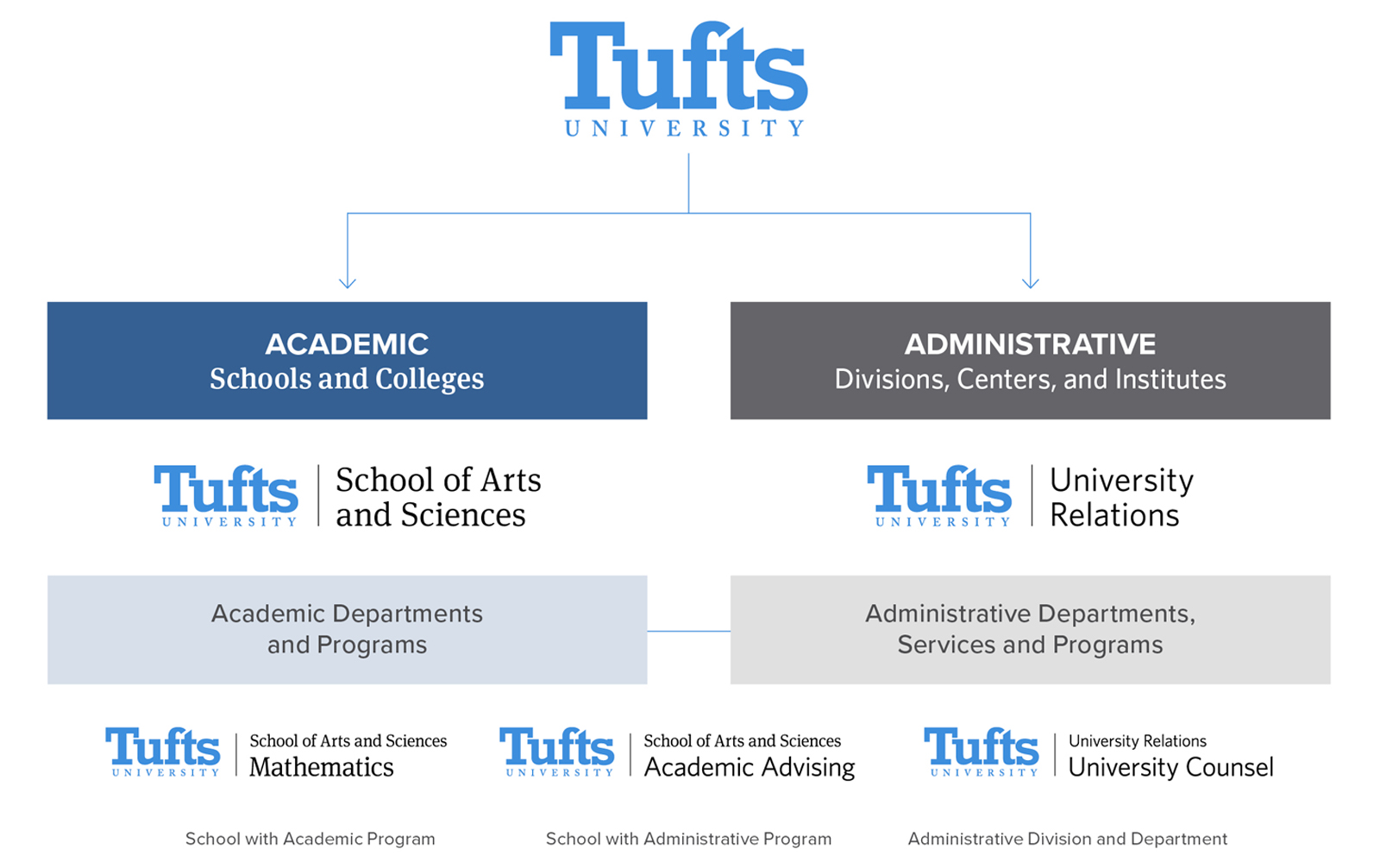
Academic
School

Standard School Treatment
The horizontal version of the Tufts mark in official blue plus the school logo in black is the primary school treatment and should be used most often. All of the rules regarding the main university logo also apply to the school logos. For example, the school logos should never be manipulated or distorted.

Variations and Alternate Treatment
Depending on the design, one of the four approved horizontal versions of school treatments as shown should be placed prominently on all communications seen by external audiences. Use the alternate vertical or stacked version when space is limited.
The school logos can be used in a limited range of two-color treatments. The main university logo should always be in a single color, in Tufts classic blue, white, or black. The school portion of the treatment can display in black, Tufts classic blue, or white.

Academic Departments
When the department name is used in an official lockup, the Tufts University logo should always be first, followed by the school name and then the department name.
Administrative
Divisions

Standard Administration Treatment
The horizontal version of the Tufts mark in classic blue plus the division logo in black is the primary division treatment and should be used most often. All of the rules regarding the main university logo also apply to the division logos. For example, the division logos should never be manipulated or distorted.

Variations and Alternate Treatment
Depending on the design, one of the four approved horizontal versions of division treatments as shown should be placed prominently on all communications seen by external audiences. Use the alternate vertical or stacked version when space is limited.
The division logos can be used in a limited range of two-color treatments. The main university logo should always be in a single color, in Tufts classic blue, white, or black. The school portion of the treatment can display in black, Tufts classic blue, white.

Administrative Departments
When the department name is used in an official lockup, the Tufts University logo should always be first, followed by the division name and then the department name.
Centers

When the center name is used in an official lockup, the Tufts University logo should always be first. Centers should not attempt to “construct” the logo themselves.
Need a new lockup for your center? Please fill out the New Lockup Request Form to request assistance from the Creative Services team. (Please do not design the new lockup independently, as all new lockups must adhere to Tufts branding.)